2010 student project
“Having been denied by the enlightenment of all tasks they could take seriously, [the arts] looked as though they were going to be assimilated to entertainment, pure and simple, and entertainment looked as though it was going to be assimilated, like religion, to therapy. The arts could save themselves from this leveling down only by demonstrating that the kind of experience they provided was valuable in its own right and not to be obtained from any other kind of activity.”
Clement Greenberg, Modernist Painting (1965)
Design Intent:
- To cultivate a unique appreciation for the arts, not only as a form of entertainment, but as an important vocation to which much dedication is required.
- To encourage a hermetically creative environment in which this appreciation and dedication is developed in, and infused into the students who inhabit the building.
- To effectively display the spirit of this environment through the design of the building to evoke outside interest in the arts.
The proposed building sits on a relatively large, flat site beyond the commerce and law faculty buildings on the Pietermaritzberg campus of the University of Kwazulu Natal. The site is dominated by the presence of a wide paved walkway which runs along the North-South axis.
The primary views are to the West, while the East side of the site runs into an open, park-like recreational space. The predominant architectural style of the campus is of a Modernist, Brutalist persuasion, predominantly in concrete. The campus is noticeably thickly vegetated. The client (UKZN) speculated that the new building must display the university’s dedication to ‘green’ development and incorporate a variety of sustainable solutions.
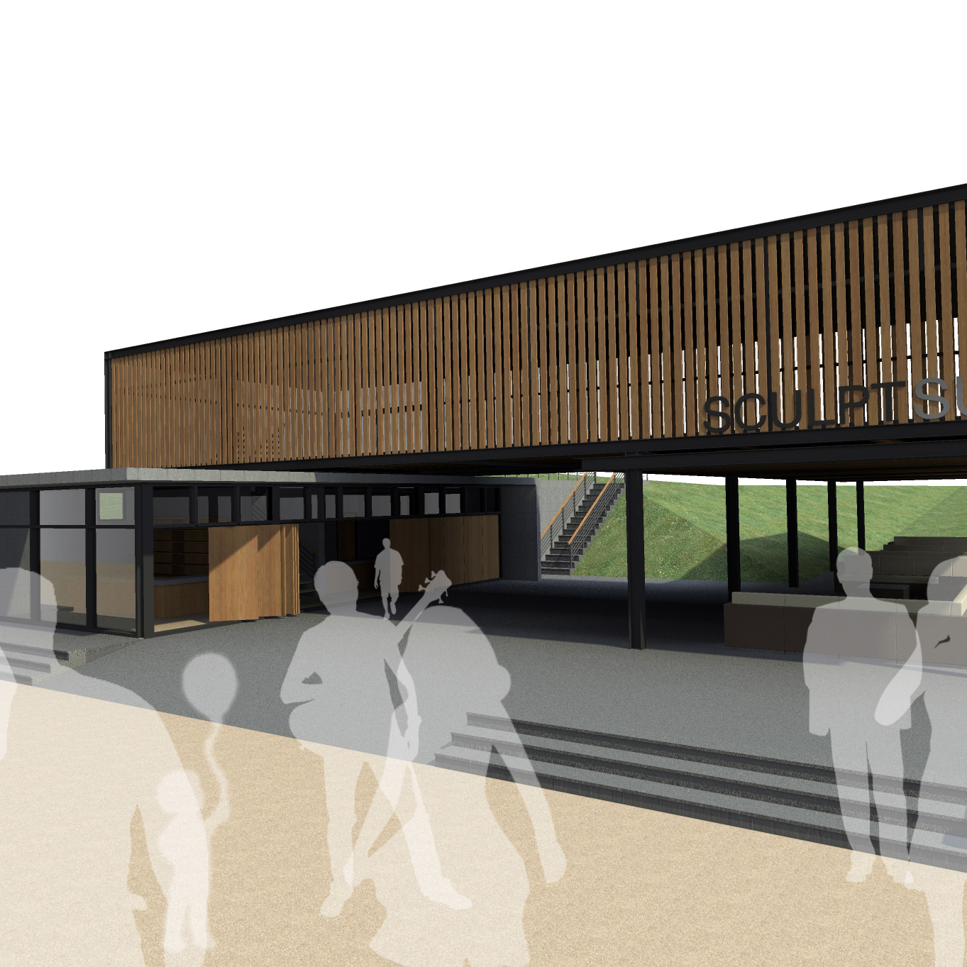
Effectively, the building was split into two halves, dissected by the path: the public functions, ie the gallery, and cafe are located on the more public ‘park’ side on the East, while the private, academic functions were placed on the West side, and afforded a slight drop in level from that of the common foot traffic. This gives a sense of seclusion and protection to the artistic process and encourages traffic into the gallery.
The axis generates a series of East-West lines parallel to it resulting in a long, narrow form on the East side and the form of the ramp and foyer circulation on the West. This is off-set by a slight angle in the form of the site on the South side, which the studios follow and sets up a radial composition for the building.
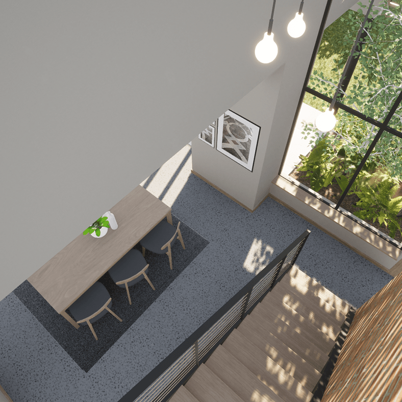
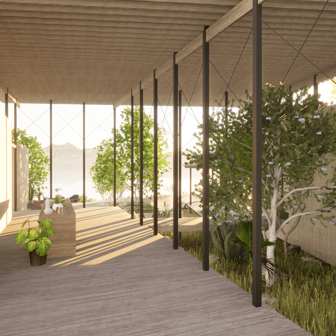
The primary circulation forms a kinked ‘L’ shape, into which the functional elements of the building penetrate. These interpenetrating volumes draw interest into the building, but also move to ‘hide’ inside the protective core structure. A bridge extends across the axis connecting the two forms.
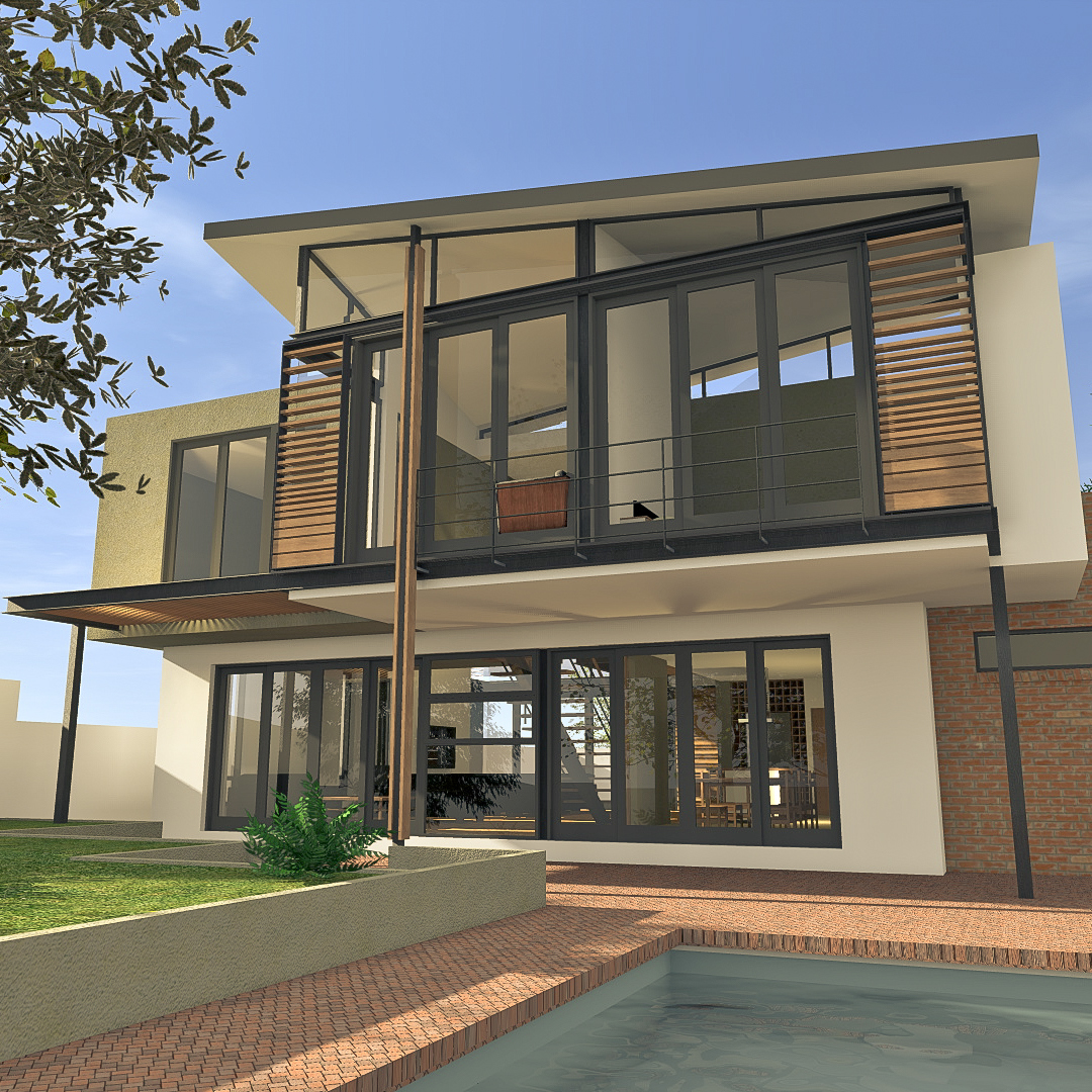
The building displays a clear repetitive order, repeating the ‘wedge’ form, glazed and louvered box, bridge, grill, skylight, etc. Although the heavy form is inspired to complement the surrounding Brutalist buildings, contrasting light elements are added such as the sun shades and skylights placed on the West side, and afforded a slight drop in level from that of the common foot traffic. This gives a sense of seclusion and protection to the artistic process and encourages traffic into the gallery.
The building utilises waterless urinals, dual-flush toilets and automatic taps to use less water. Rainwater is harvested and stored in large ‘Jojo’ tanks. Grey-water is filtrated through an underground system behind the building and used with rainwater to flush toilets and water the gardens. Run off is fed to the rest of the university. The core of the building is completely permeable allowing cross ventilation to spaces, and all habitable are day lit and naturally ventilated. A double skin system is used to insulate the computer LANs, and a mainframe system used (installed in archives) with workstations networked via ‘thin clients’ so as to reduce heat build up from excess hardware.
